Here is one of the charts how to make date to look more interesting. With kind of chart we can show the progress of sales in different branches or any other progress between several competitors.
At the beginning let’s have simple table with 7 columns. In the first column should be names of the variables you want to compare. In the second column should target for every variable. In the third column are fulfillment to date. In the fourth column is progress. So basically in cell E4 is C4 divided by B4. In the fifth column is length of the progress bar (blue bar). As you can see it is one percent less than the progress as i chose to have slider 2 percents of the whole progress and it is fill by brown color. So that’s what it shows in the F. And finally in the column G is length of the whole progress bar.
Now all you need to do is insert stacked bar chart based on the range E4:F10. And here is the beginning of the progress chart.

In the next step add one more variable from column G (Total Bar) and let’s leave it as primary axis.
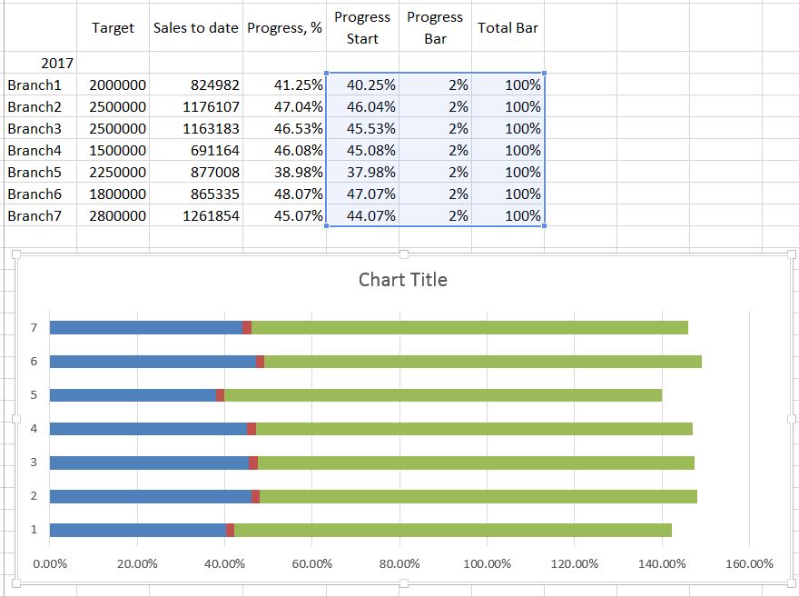
Let’s make “Progress Start” and “Progress Bar” as secondary axis and let’s give to those bar’s more thickens. Hopefully you will something similar as in the picture below and now it starting to look more like a progress bar.
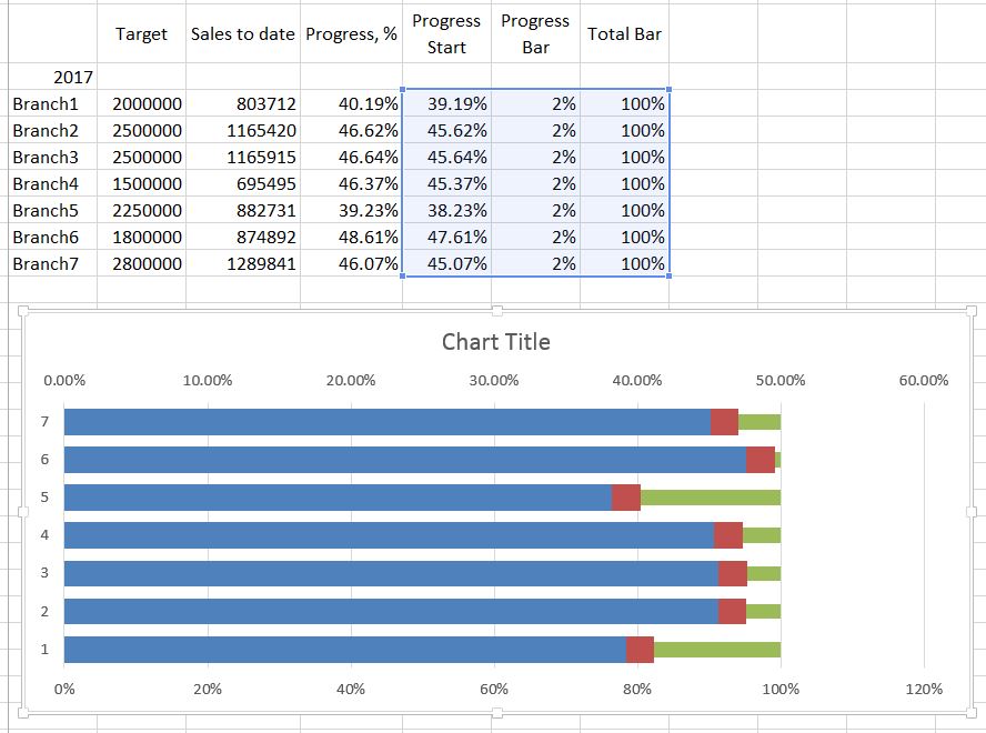
In the next step some color games start. Let’s make “Progress start” (the blue one) invisible. For the “Progress bar” you can pick any color you like. And finally “Total Bar” you can fill some gradient. I have also added borders on “Progress Bar”. Don’t forget to align primary and secondary axes. I made max value for bot 100 percent. Now you can remove secondary axis as it is enough to have only one axis at the bottom. It that way chart will look more clear, understandable and will be easier to read it.

If you have time period for the progress, you can add one more column. I made for 2017 and it measures on daily basis. As you can see there is only “Progress start” (Blue fill) and “Progress Bar” (grey fill). Those colors you pick by select only that particular column.
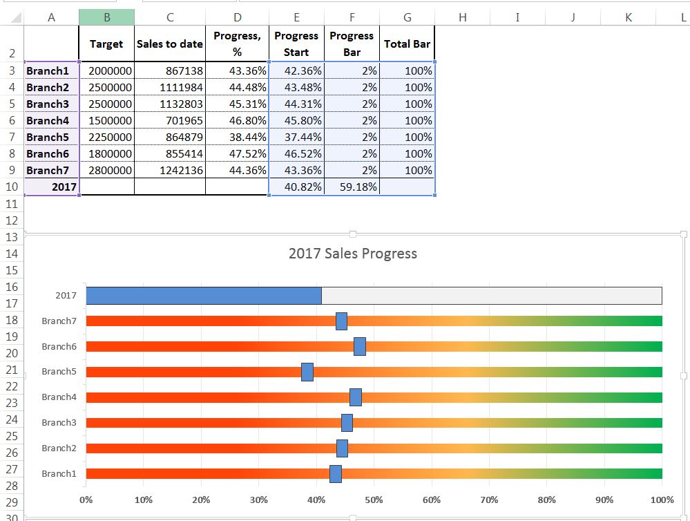
It looks like we are done with our progress bar chart. And of course you can be more creative and add some fancy nice looking things and make your chart look even better. Just be creative and stay smart.